2001–2022 | Ross Video
Product launches, brand work, and visual storytelling created during my time at Ross Video. Spanning design, narrative, copy, renders, animation, naming, and whatever each project required to come together.
My current studio work can be found at rippledesign.ca
It just doesn’t get old… Branding, advertising, choreographed visuals, copy, and communication material (still / motion / video) – from design brief to the world stage and everything in between...
In front of a monitor. Leading a team. Following a mandate. I have the people and technical skills it takes to produce organized projects along with clean, industry-standard files / assets that get noticed.
CONCEPTS THAT SWEETEN PERCEPTION
Helping build brands and culture from the ground, up… Designs, words, proposals, and experiences that command a second look.
Out of concern that going with a utilitarian faceplate design could create a perception that Ultrix was “just another router” rather than a pioneer in the unique product category it was creating… I was invited to collaborate in the design and brand development for Ross’ Software Defined Production (SDP) connectivity platform.
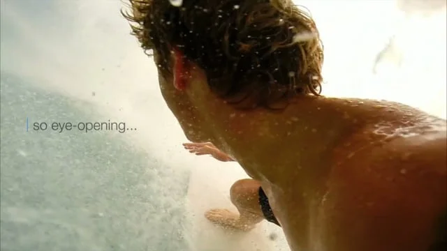
For its market introduction, we injected a touch of lifestyle imagery and communication material inviting customers to “Catch the Wave!” As part of our thought leadership aspirations > early adopters that “caught the wave” would come to realize, evangelize, and socialize the reduced complexity Ultrix delivers.
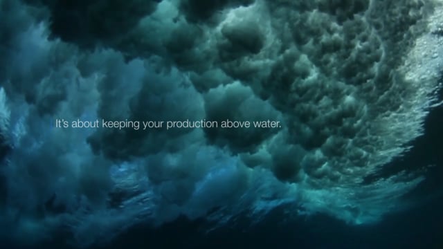
Positioning Ultrix as a means to help keep “your production above water” – its promise is to do more with less… space, power consumption, and complexity.
A slick product design crowned with a prominent wave feature helps Ultrix stand completely apart from anything else in the industry… The wave design also became the perfect host to introduce “FrameGlow” > a highly visible LED lighting element offering at-a-glance status or functionality. This product innovation is now seen as a unique Ross product family identifier that truly stands out and resonates with customers around the world.
PERSONAL DELIVERABLES
• Surf Concept
• Taglines
• Product Aesthetic 3D Design
• Product Renderings
• Animated Launch Videos
• Social / Web / Print Assets
• Exhibition / Tradeshow Assets
“It’s about keeping your production above water.” Brand Narrative
Produced the Ultrix Introduction Video (project management, graphic elements, script, animations, interstitials, and post show video editing for web, social and future exhibitions.) Also provided Creative Direction and collaborated on corporate positioning for annual NAB Keynote event.
3D Product Aesthetic Design and Renderings / Brand Voice / Brand Narrative / Taglines / Graphics / Copy / Content Creation / Assets for Print & Animation
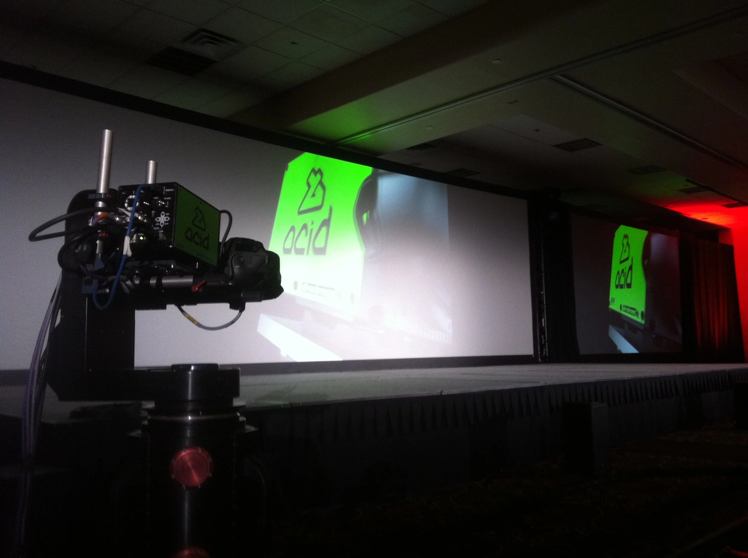
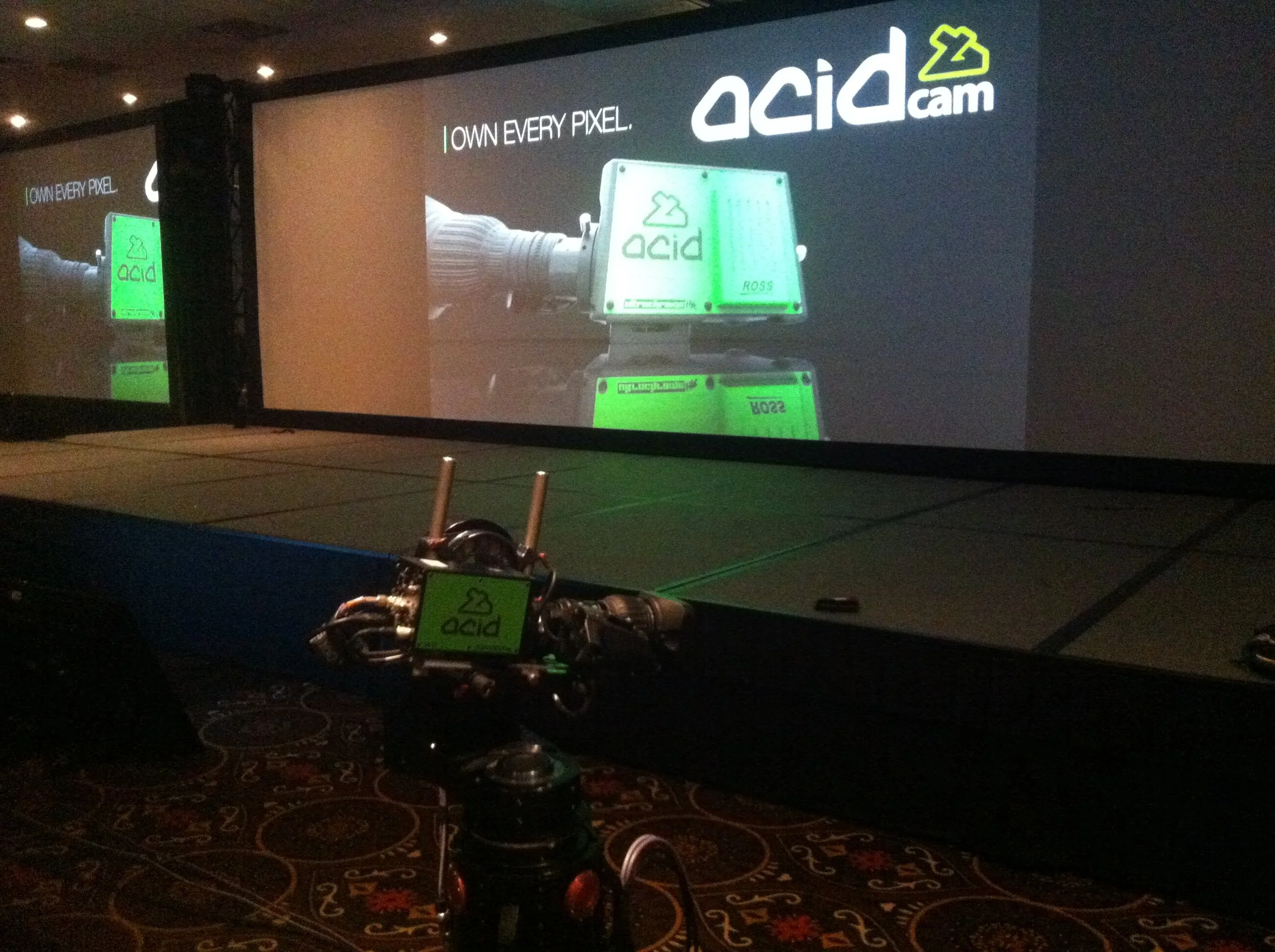
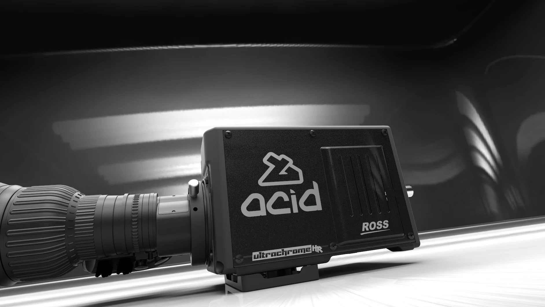
ACIDCam studio cameras were a new product category for Ross. By form factor, it was being released into a sea of visually similar studio cameras, but ACIDCam had a major competitive advantage > a special ability to excel at chroma keying.
Finished in vivid green the product design instantly identifies itself from a distance and effectively owns “chroma key green.” With ever-improving technology capable of producing higher-and-higher resolutions, the hyper-realistic live key market is set to rise. ACIDCam is poised to be the first touch-point of a live event, ready to deliver the most realistic keys in the world.
This product introduction was a breakout for myself as a brander, designer, animator, and product positioner. Fortunate to work with a fantastic product manager who believed in our concept even though it was “sooo faaar” outside the scope of anything we’d done before. The concept generated a lot of positive feedback and truly kick-started a new body of work for me that was unmistakably Ross.
PERSONAL DELIVERABLES
• “Own Every Pixel” Concept
• Taglines
• On-Product Branding
• Product Renderings
• Animated Launch Videos
• Social / Web / Print Assets
• Exhibition / Tradeshow Assets
Was fun to watch the new camera shoot video of it’s own unveiling :)
ACIDCam, meet ACIDCam. Oh, and Own Every Pixel too.
Killer show! Ran at this massive undertaking with a real fun and highly skilled team. Grey hairs and great memories go hand-in-hand sometimes.
An optional side-plate color choice for discreet installations.
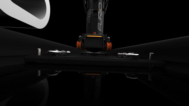
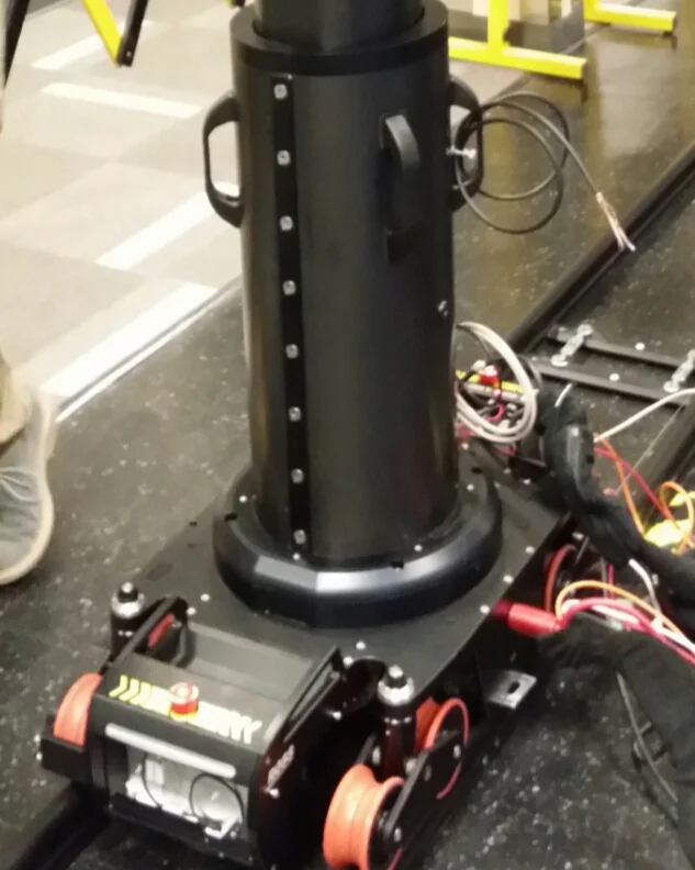
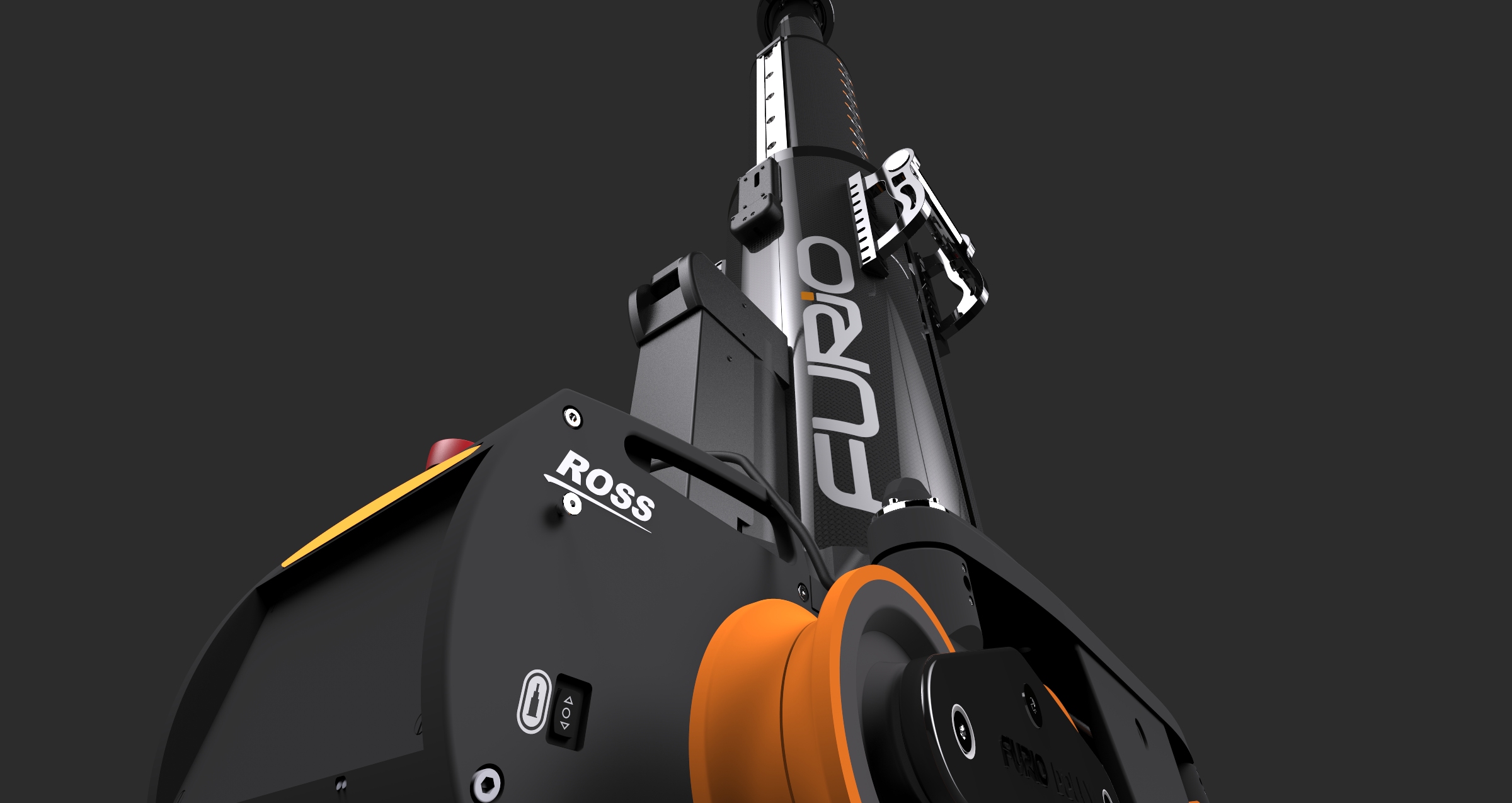
Furio SE is a floor-mounted, rail-based robotic camera system. Furio SkyDolly is the ceiling-mounted variant…
I was tasked with producing new branding along with a product aesthetic graphics package to match its improved mechanical, software, and performance specs. Furio is one of my favorite collaborative projects to date.
The product development team was a passionate and deeply engaged group. Every aspect of the design project was pragmatically debated by developers and experts in the field… right down to the increment design on the lift column. Just awesome.
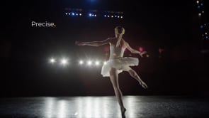
Furio’s natural environment is at the edge of a studio, stage, or even alongside sporting events like swim races and track events! With the launch of the new product design for Furio SE > we built a message around the “SE” (Smart Evolution) features this design affords, while highlighting the fun factor creatives will have with this new tool. For Furio SkyDolly, we continued the branding theme from SE, giving us an opportunity to pivot the message toward precision, sophistication, and safety—while showcasing SkyDolly’s ability to provide uniquely intimate visuals.
It’s been fun to follow along with the big-ticket concert tours and major television broadcasts it helps produce.
PERSONAL DELIVERABLES
• Furio and Furio SkyDolly Logos
• Taglines
• Product Aesthetic Branding and Treatments
• Product Renderings
• Animated Launch Videos
• Social / Web / Print Assets
• Exhibition / Tradeshow Assets
“Sight Control” Panhard bar spread > Furio RC
I was invited to collaborate on product aesthetics and launch package somewhere around here…
Concept, promotional assets and collateral
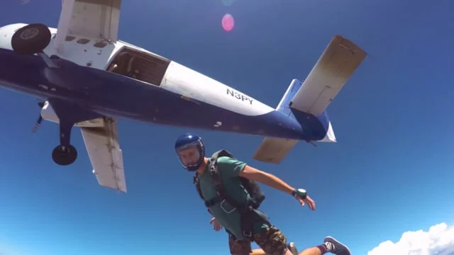
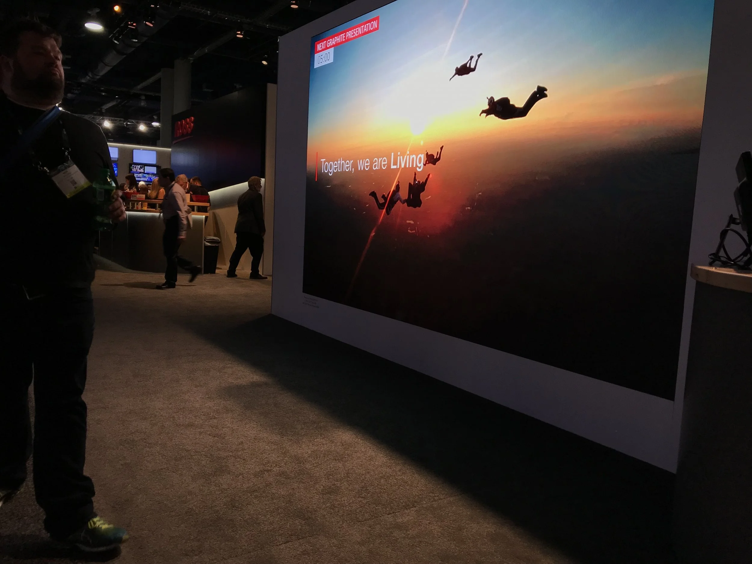
Corporate tagline, positioning statement, and skydiving concept. “Living Live!” is an organic statement that reflects what Ross does to help clients deliver amazing productions to billions of global viewers every day.
The skydiver imagery draws a parallel between the excitement of jumping from a plane and the adrenaline rush live production staff feel when the show begins. There are no redo’s in live production.
This project became a marquee initiative. The corporate skydiver video was proposed to a (very creative) Senior Management Team as a simple script I read aloud with the proposed footage and music playing on my monitor—after a few collaborative adjustments, the script and skydiver imagery quickly became the face of the brand.
The versatility of the voice-over and onscreen graphics allows the video to adapt to its environment. It can play without audio at events and be translated in multiple languages for global use.
PERSONAL DELIVERABLES
• Skydive Culture Alignment Concept
• Taglines
• Launch Videos
• Social / Web / Print Assets
• Exhibition / Tradeshow Assets
“3, 2, 1 Go!” Culture Alignment > Ross Video Corporate Branding
Ross Corporate Placement Video - Living Live! > Brand Promise
“Finding Each Other” Culture Alignment > Ross Video Corporate Branding
Living Live! > Corporate Stationary
Living Live! > PowerPoint Decks for all Corporate and sub-brands.
Living Live! > Small Event Signage
Living Live! > Major Event Still and Large Format Video Screen
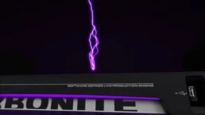
Carbonite Black, Solo, Solo USB Ingest, and Ultra have always held a special place in my journey to becoming what I am as a designer… one of the first product launches we produced entirely with renders. The newly adopted workflow proved to be a powerful new way to design creatively.
Outside of being a blast to learn and work with, adding 3D rendering technology completely changed the way we approach product releases... for the better.
Photos and video still play an important role, but a render can help bridge a product availability gap. With proper rigging and lighting, a hyper-realistic render can rival a photo—especially when details like micro-scratches, dust flecks, and other nuances are baked in.
Through learning how to properly include pixel-level details, I started to get comfortable with the new tools, and have come to develop a fresh design style around the visualizations we were producing. The success of the initial Carbonite Black launch video opened new opportunities for me at Ross, leading to increased responsibility for industrial design, exposure to product marketing, and the production of choreographed launch videos with a style that commands a second look.
PERSONAL DELIVERABLES
• Product Renderings
• Animated Launch Videos
• Print / PDF Brochures
• Web / Social / Print Assets
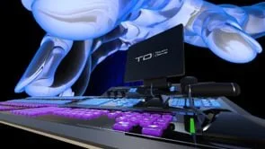
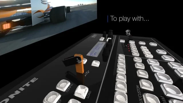
“Production Wizardry” Brand Alignment / Promise > Carbonite Ultra Product Aesthetic Design and Brand Concept
Keynote style video to introduce our newest production switcher control panel before our CEO covers the details.
The concept continues the production switcher wizardry theme started with Carbonite Ultra.
Carbonite Black > Product Renders and brochure design
Carbonite Black > Product Renders and brochure design
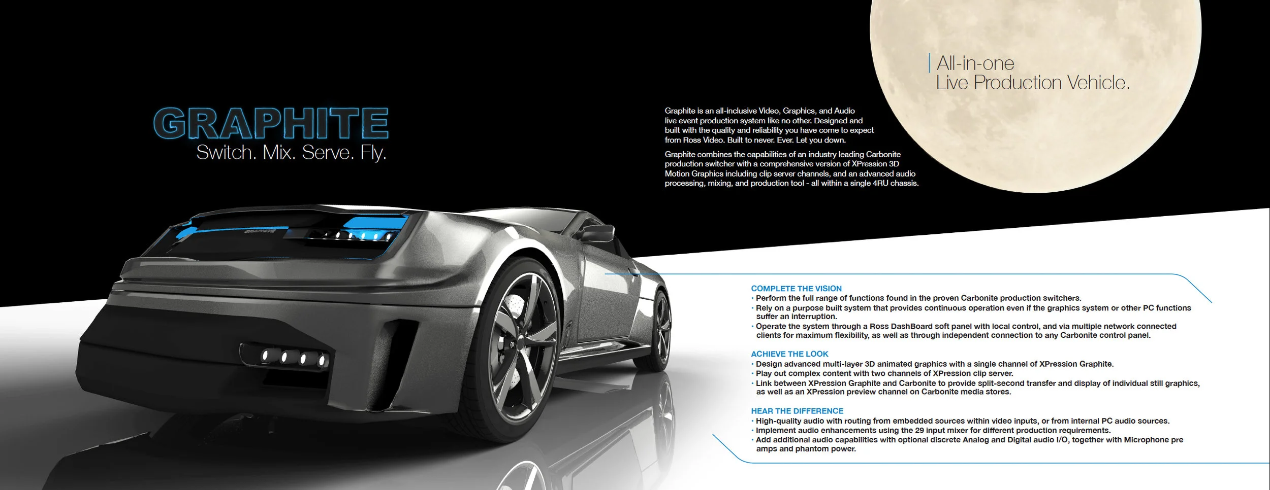
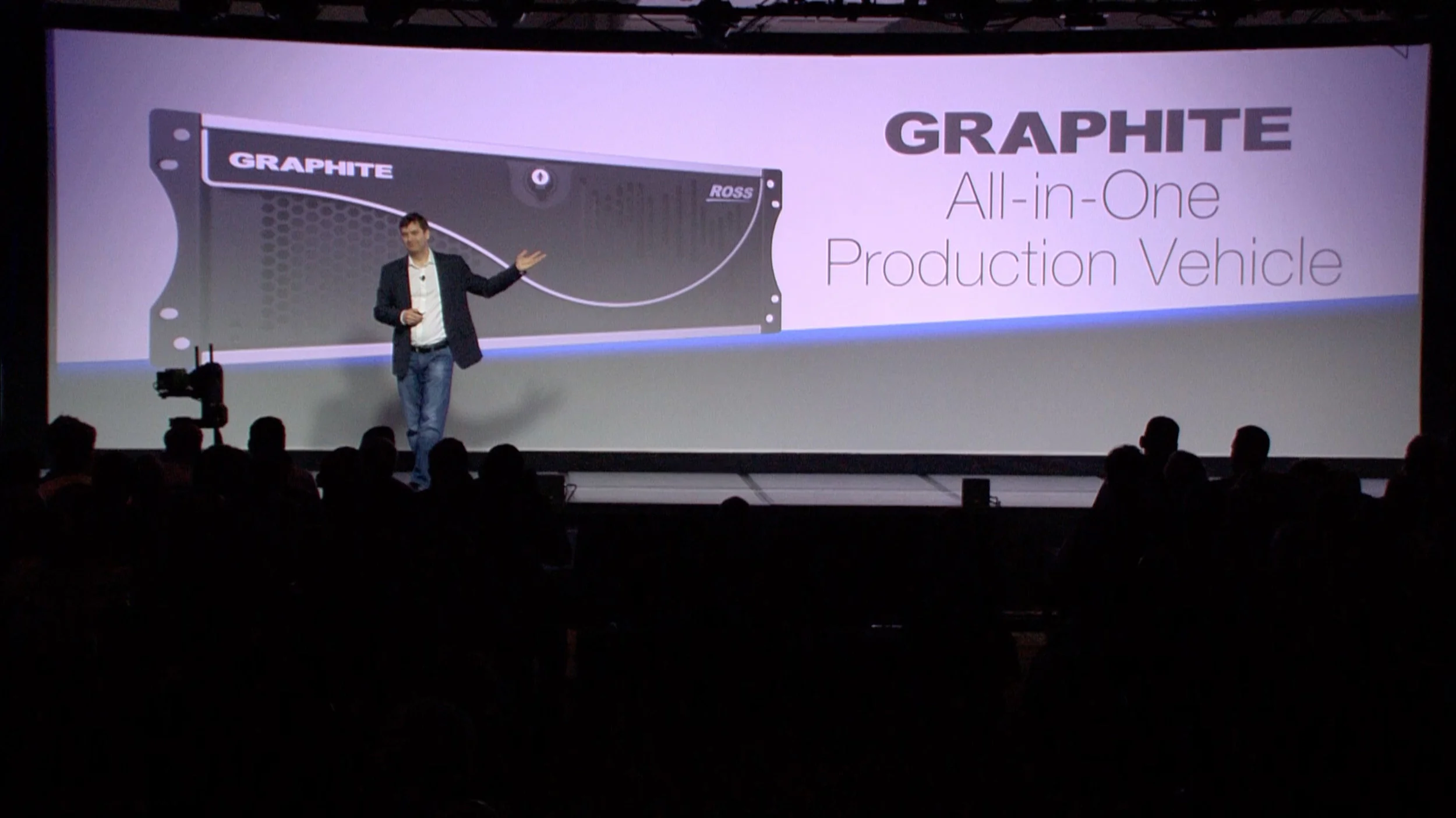
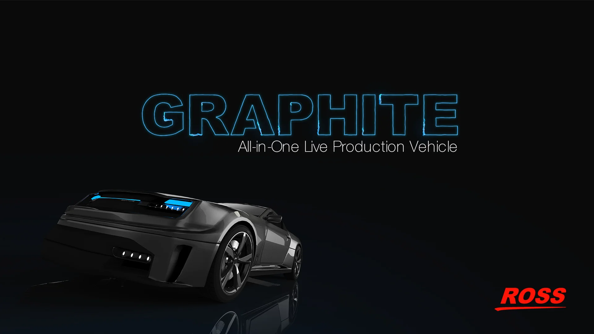
Serious hardware for serious productions. All-in-one studio in a box… The design brief called for a message built around the performance benefits a hardware-based, all-in-one production system has over software-based solutions.
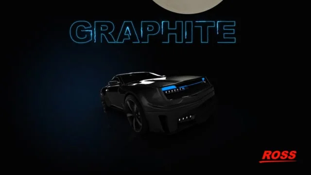
We decided on “production vehicle” as a concept—it offers everything a professional needs to produce a high-end show. “Bad-Ass” was the echoing term during early discussions about the Graphite chassis and its decked-out specs.
Our “production vehicle” overflowed with a bespoke promise of power, and the scenes were designed to heighten intrigue. This is what came to be…
PERSONAL DELIVERABLES
• Live Production Vehicle concept
• Taglines
• Product Renderings
• Brochure
• Animated video
• Web / Social / Print assets
“Make your Mark” logo / icons > Graphite Branding (unselected)
“Leave your Mark” Brand Promise > Aethetic Design Pitch (Unselected)
Graphite “One more thing” introduction moment.
“All-in-one Production Vehicle” Desktop Image > Graphite Product Software
The reality of marketing extremely complex products… it becomes a race between engineers trying to deliver a working prototype and marketers trying to get what’s needed to launch it.
Oh the fun :)
Physical product was running late from the development team, and we were only going to have it for an impromptu hour > not enough time to produce a polished keynote video. A DSLR, slide dolly, and creative lens flare tricks in After Effects helped mask a missing module or two. Photoshop handled the rest for web and print.
Adding to the challenge was the high-gloss finish—like photographing mirrors. Every surface reflected its surroundings, requiring a ton of patience in post.
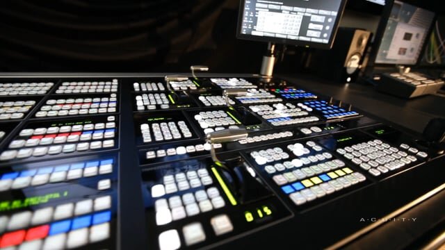
Thanks to some resourcefulness and a few heroic suppliers, Ross unveiled the new switcher on time with a full suite of launch collateral. The Acuity brochure was written and designed to reflect the creativity, business sense, and engineering baked into this flagship product. Odds are, you’ve already seen a show made using one.
PERSONAL DELIVERABLES
• Brochure
• Drama Video
• Photographs & Videography
• Web / Social / Print Assets
• Exhibit Graphics
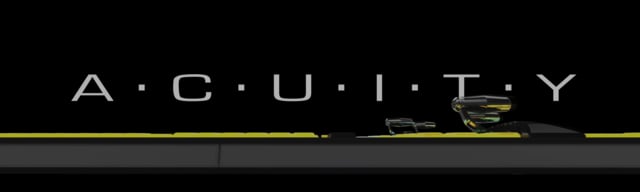
4K Spread > Acuity Brochure
We injected a lifestyle theme into an otherwise technical marketing piece to entertain and build culture. This example from an extreme sport event - demonstraties in simple terms, the benefits of a 4K production workflow in a way a lucky few can relate to or aspirationally dream to be involved with.
Behind the scenes at our annual industry keynote event. A rear-projection video production, it made for an interesting perspective seeing things reversed (flipped image) after watching it in forward so many times during it’s animation.
World premiere for flagship production switcher with technology ahead of it’s time. Design Brief > “A beta-build Acuity is passing through the factory today, they’ll let you have it for about an hour this afternoon just before it gets shipped to NAB (Major industry tradeshow event) in Las Vegas… Get what you can”. Sigh…Highlighting the Mnemonics, PanelGlow (RGB LED buttons), and gloss black paint finish, the video was available in time for it’s unveiling.
Photography / Video / Post / Graphic Design (print & web)
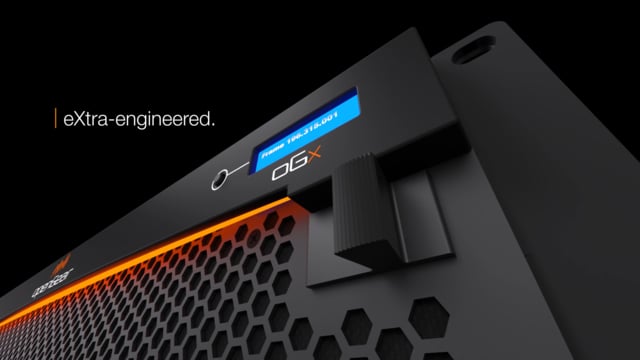
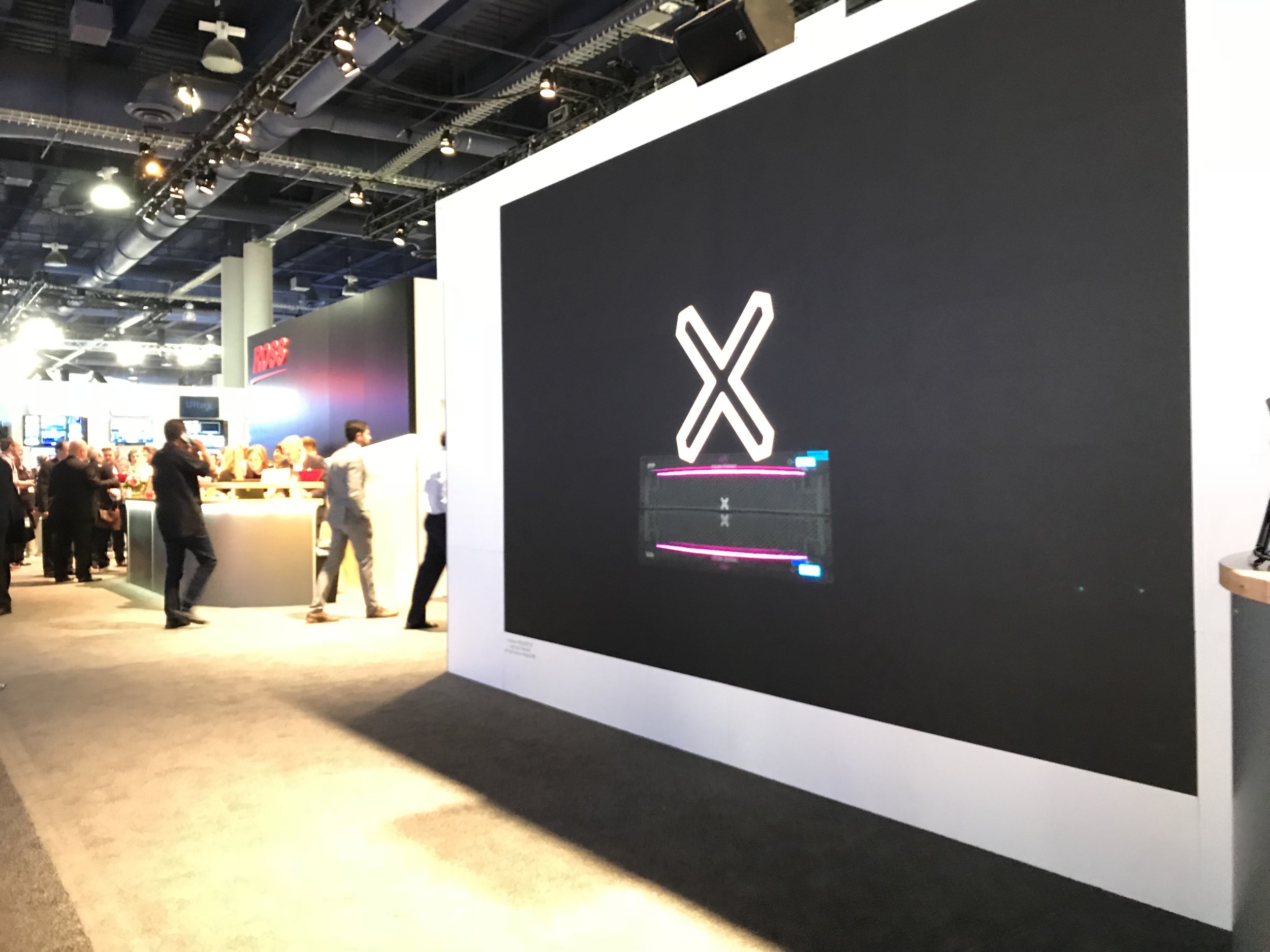
openGear terminal equipment lives in a competitive market. Products in this space typically sit inside utilitarian-styled “frames” stacked in a rackroom. For the oGx rebrand, we used the opportunity to rethink the faceplate as the hero of a complete identity refresh.
We built the brief around the frame door and crowned it with a new logo. The logo nods to the openGear partner ecosystem—the line segments above the name represent the various signals, functionality, and the number of cards an oGx frame holds (x10).
For added prominence in the rackroom, oGx introduced FrameGlow, a signature LED status indicator now synonymous with Ross rackmount gear. Designed for broadcast engineers, it offers at-a-glance system status while looking pretty slick in the dark.
PERSONAL DELIVERABLES
• eXtra capability concept
• Product aesthetic 3D design
• Brand voice
• Taglines
• Product Renderings
• Animated video
• Web / Social assets
Produced the oGx Introduction Video (project management, graphic elements, script, animations, interstitials, and post show video editing for web, social and future exhibitions.) Also provided Creative Direction and collaborated on corporate positioning for annual NAB Keynote event production.
“Marks the Spot” Tagline
oGx > Complete Product Launch Asset Package
3D Product Aesthetic Design and Renderings / Brand Voice / Taglines / Graphics / Copy / Content Creation / Assets for Print & Animation
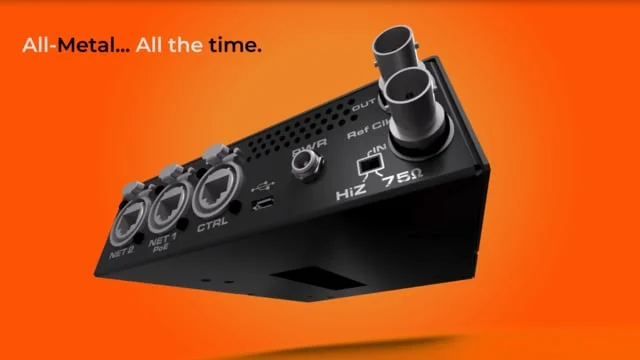
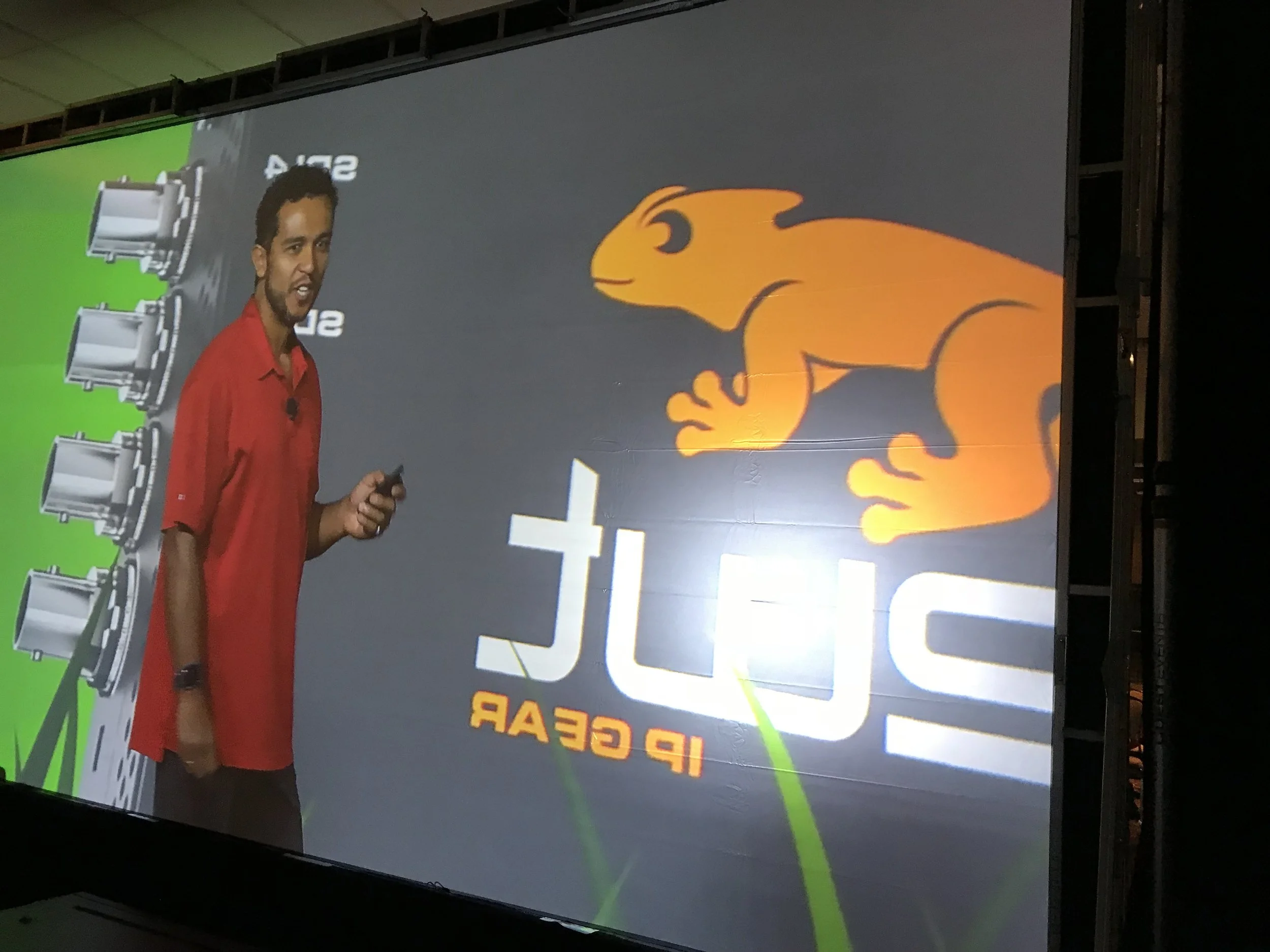
As a technology leader, Ross put an early stake in the ground with IP and Software Defined Production (SDP) development. Even as an emerging technology, interest was growing fast—and the need to show a cohesive product ecosystem was becoming more important.
Tasked with visualizing that system, I was given the product name “Raptor” and started building a logo ecosystem based around evolving creatures—avoiding anything primitive or underdeveloped. For the next project, we introduced a compact line of “go-anywhere” modules. I continued the theme with a family of little critters—each with baked-in personality—and a slogan: “Grab hold and never look back.”
A really fun project with an enthusiastic team.
PERSONAL DELIVERABLES
• Critter Concept
• Product Labelling
• Product Renderings
• Animated Launch Videos
• Social / Web / Print Assets
• Exhibition / Tradeshow Assets
Smart Production > IP Ecosystem Print Advertisement for Trade Publication
iggy (IP Audio Converter) Logo Design > Product Ecosystem Brand Continuity
Best seats in the house from the production side of the curtains, as long as a mirrored image doesn’t bother you :)
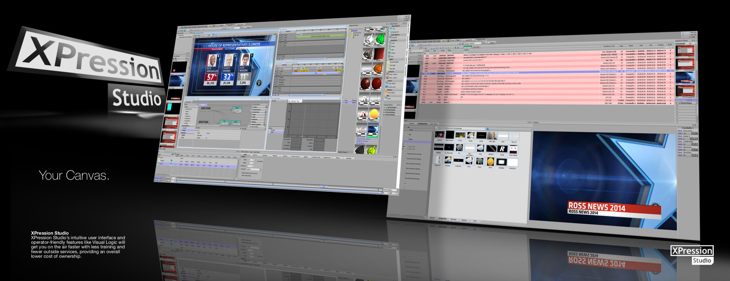
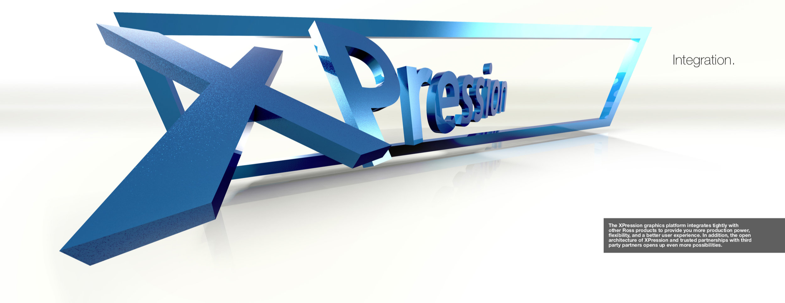
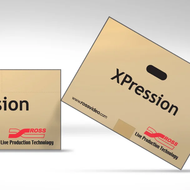
XPression (real-time 3D motion graphics system) needed a dramatic print ad and a detailed brochure to help build mindshare in the live broadcast industry.
With software and hardware due for an update, we focused the piece on brand awareness—showcasing the XPression logo in several bold, dramatic spreads throughout. We wanted creative users to imagine what they could do with it, rather than see examples of what others had done.
The result was a piece that spoke to creators first, then backed it up with clear content for technical and business buyers.
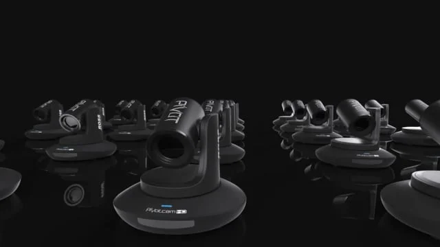
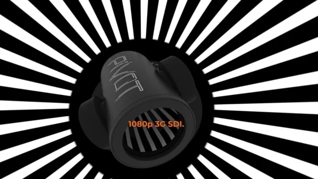
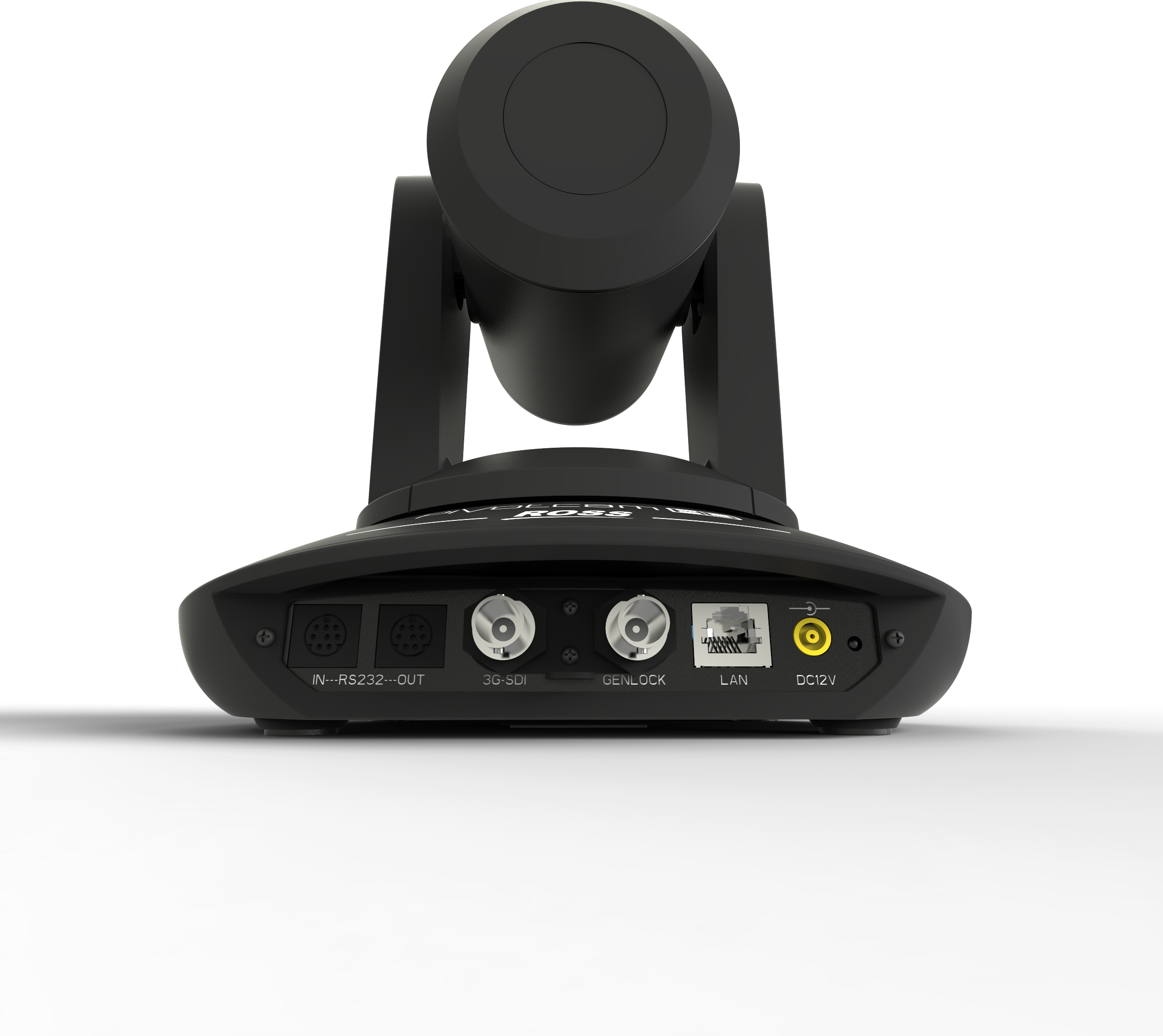
PivotCam was a quick and fun project. The product had wide appeal—from news production to concerts to podcasters—offering dynamic new camera angles with simplicity and affordability.
The logo was developed with a traced-path design. The “V” was stylized as a carrot, inserting itself into the name—and doubling as a fan with arms raised in support of their favorite performer.
PERSONAL DELIVERABLES
• Pivotal Moments Concept
• Taglines
• Product Aesthetic 3D Design
• Product Renderings
• Animated Launch Videos
• Social / Web / Print Assets
• Exhibition / Tradeshow Assets
PivotCam Product Renders
PivotCam Product Renders
A few things I’m not sure how to archive…
Always changing, this page may contain rough sketches, logos, ads, animations, splash screens, ideas, and more.
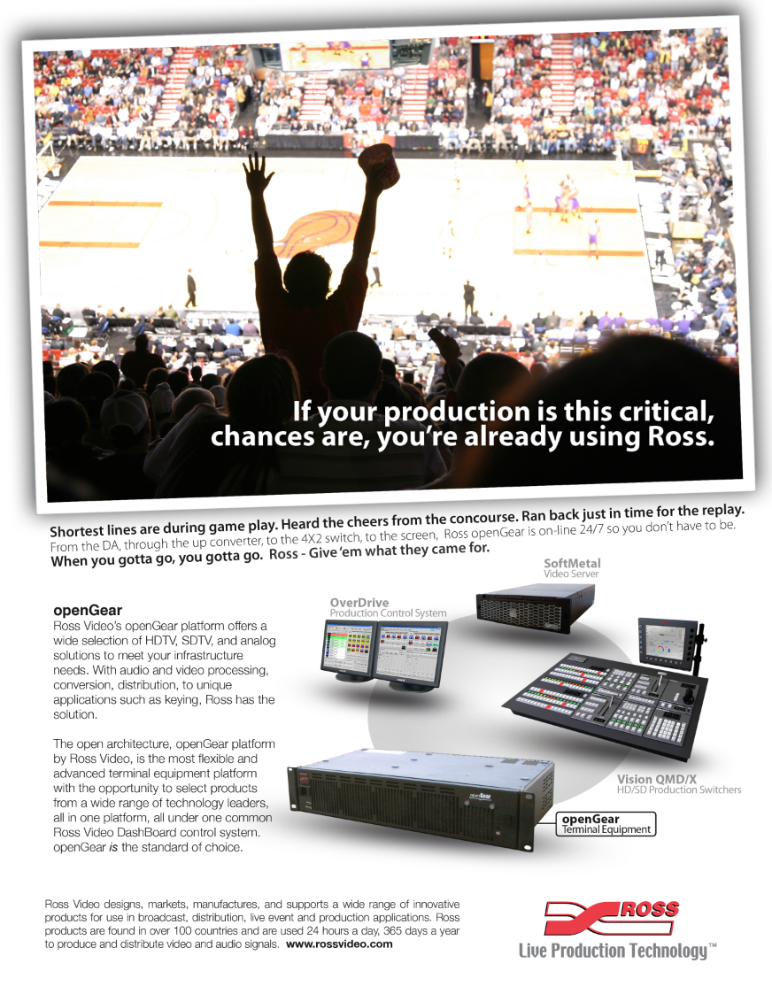
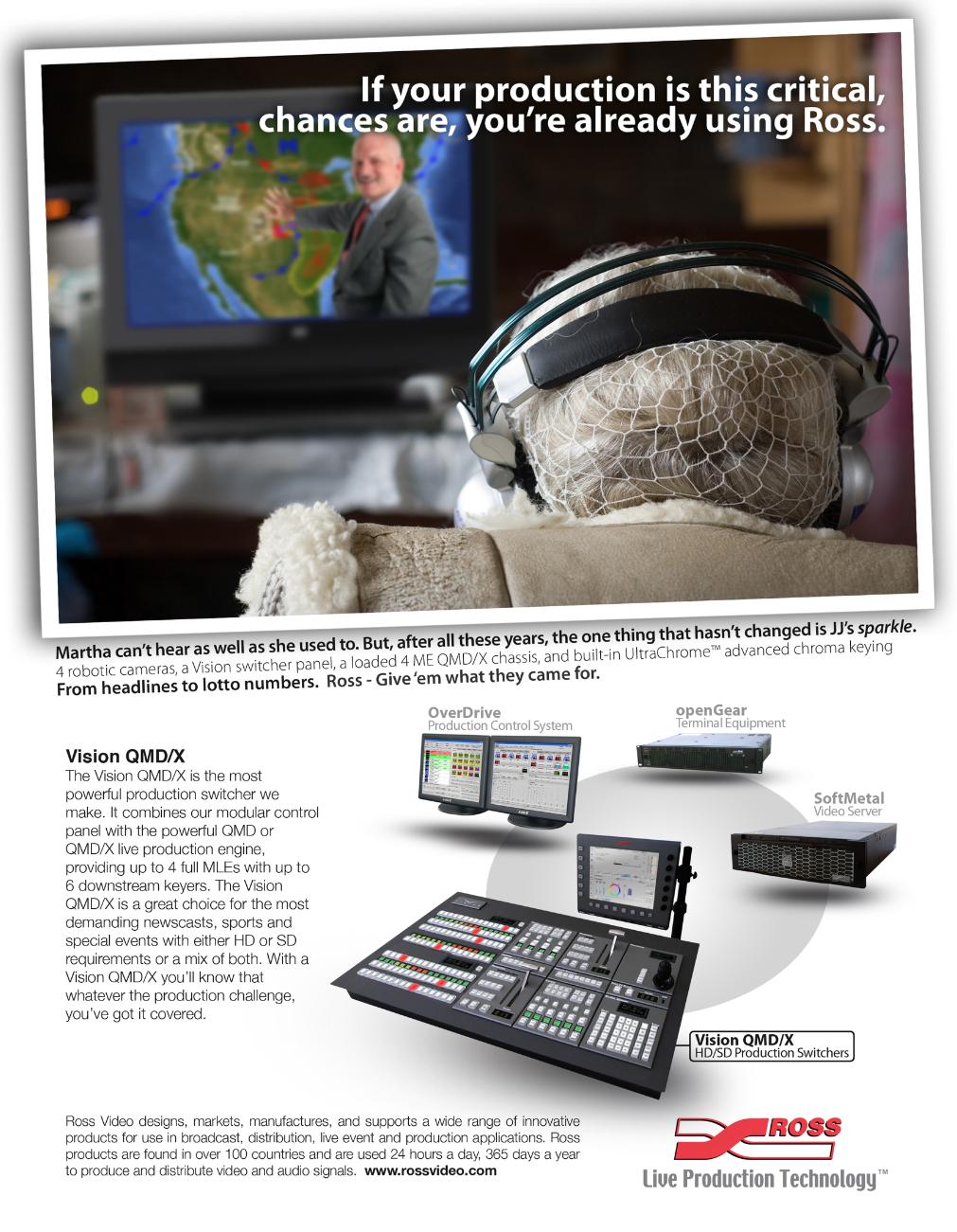
This was a collaborative concept conceived with Frank Grenier (creative and digital marketing Guru). With minimal budget and maximum freedom to develop ideas to grow mindshare, this is what we came up with.
A storytelling-style built around an engaging photo, with an entertaining story about the moment and the equipment being used to create the viewer experience. Flowing down to the lower section, a featured product gets an overview while the graphic calls attention to other products in the portfolio, followed by the corporate boilerplate and branding.
The company now has over 20 different product lines and services. I’d like to think that some of that growth and success stems directly from collaborative projects such as this.
Looking back… Time flies by in seasons when you’re immersed in the demands of content creation.
Branding projects become a high for me when creative people come together and pour passion and skills into it. Thankfully, the path to my current position has been filled with super-talented subject-matter experts from many fields over the years… It’s been a truly rewarding career choice for me…ツ
This was my original PDF portfolio—before I moved everything online. It’s not perfect, but it captured where I was at the time, and it shows how far I’ve come.